A rebrand of a product called eCred from Serasa. It offers smart solutions for consumers to obtain different types of credit cards and loan modalities tailored to their profile. The company offers a consumer experience through both its website and its app.
Client
Serasa
Service
User Experience (UX ) Design
Data
2022
Project Overview
The challenge
This project involved a complete overhaul of the eCred product by Serasa. The goal was to offer smart credit solutions (credit cards and loans) tailored to each consumer’s profile.
We identified two core problems that were stifling product growth:
1. Visual Fragmentation: Each Serasa product had a different color palette. This confused users, who often failed to realize that the product belonged to the trusted Serasa ecosystem.
2. Lack of Clarity: The name “eCred” did not clearly communicate the value proposition and failed to generate sufficient trust for conversion.
Key Project Questions
• Brand Perception: Does the current name aid in organic search and user recall?
• Usabilidade (Web vs. App): Why does the Web version have more steps and lower conversion rates than the App?
• Ecosystem: How can we unify the identity so users feel the security of the master brand (Serasa)?
My Role
I led both strategic and operational Product Design fronts:
• Brand Strategy: Defining a name that leverages organic traffic and clarity.
• UX/UI: Unifying the Web and App experiences, reducing friction.
• Design System: Creating visual consistency with the rest of the Serasa product suite.
First Steps
Strategy & Design Process
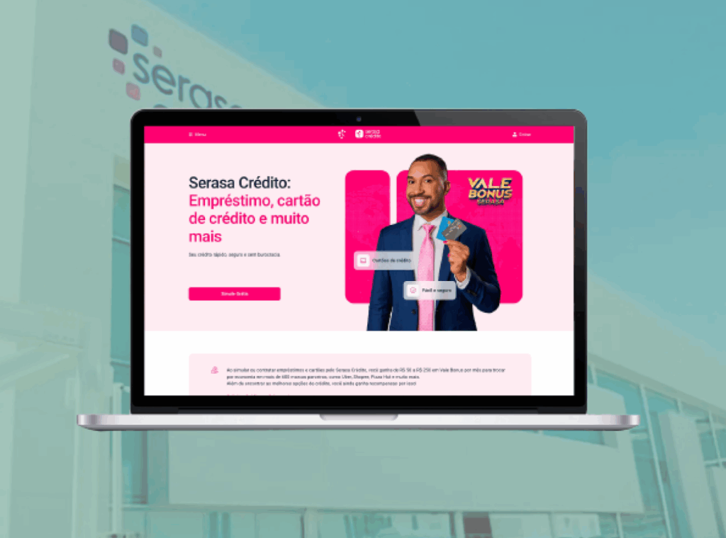
The Naming Strategy (SEO & Clarity) The shift to Serasa Crédito was not just about looks; it was about results:
• Easy to understand: We selected a familiar term (“Crédito”) so the general public could instantly understand what the product offers.
• SEO Strategy: Since “Crédito” is a very popular keyword on Google, using it in our name helped us gain more organic traffic. This allowed us to attract new users naturally, reducing our reliance on paid advertising.
Prototyping & Testing
With the visual identity defined, we focused on making the experience consistent. Our research showed that the Web version had too many steps compared to the App.
Action: We redesigned the Web flow to match the App flow (which was already performing well).
Validation: We tested the new flow with non-tech employees who had used competitor products. The feedback was great: everyone agreed the new experience was simple, fast, and easy to use.
Outcomes
Launch and Continuous Improvement
Following the launch, the Design, Analytics, and Marketing teams monitored the website’s performance and the reception of the new brand. We collected user data and feedback to understand the impact of the changes and the results achieved after the update.
The final result
Results & Conclusion
The project brought real value to both the business and the user:
• Organic Growth: The name “Serasa Crédito” ranked better on Google (SEO), bringing in more users for free.
• User Trust: Using the same design everywhere eliminated confusion. Users now feel safe knowing they are using a Serasa product from start to finish.
• Conversion: Making the Web flow simpler and matching the App reduced the number of users leaving the page (drop-offs).